The Problem
As a digital-first financial institution (no physical branches!), PSECU relies heavily on its online and mobile app dashboards. These interfaces serve as the primary gateway for members to access all our digital offerings. Our existing dashboard lacked clarity, visibility, and a welcoming aesthetic. It failed to engage users, often conveying a sense of complexity and cumbersome. Recognizing this as a critical issue, I performed a UX audit to identify the root causes of these problems.
The Solution
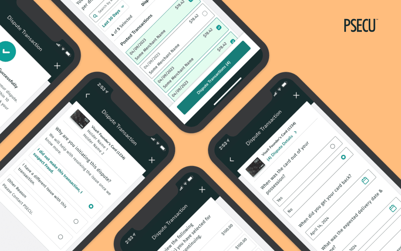
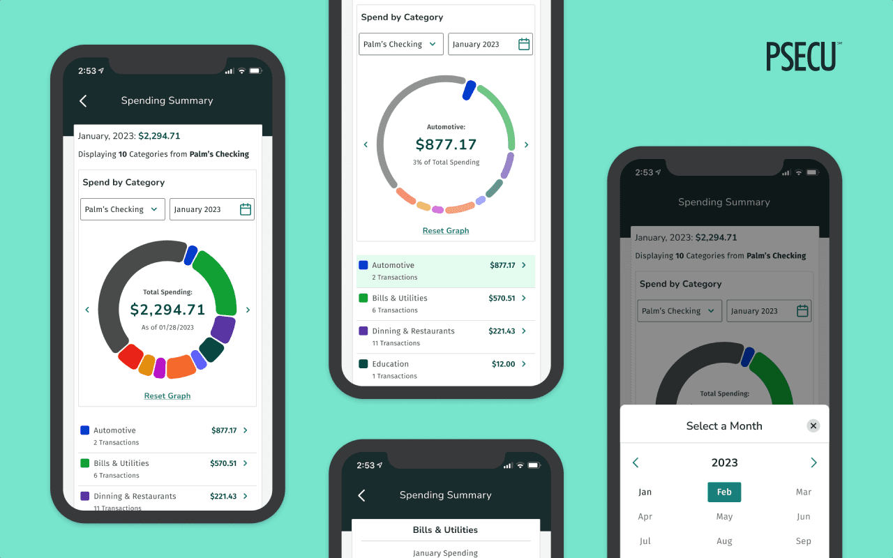
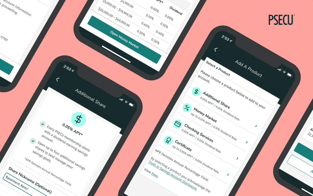
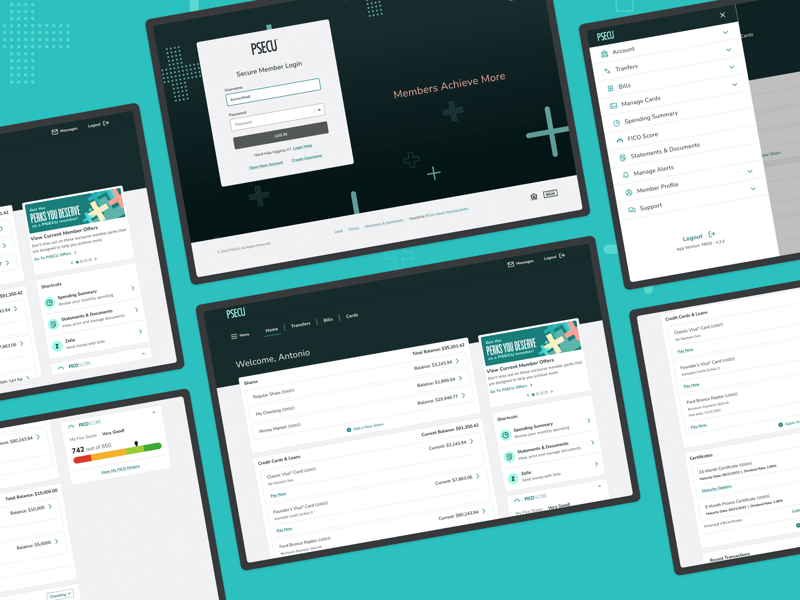
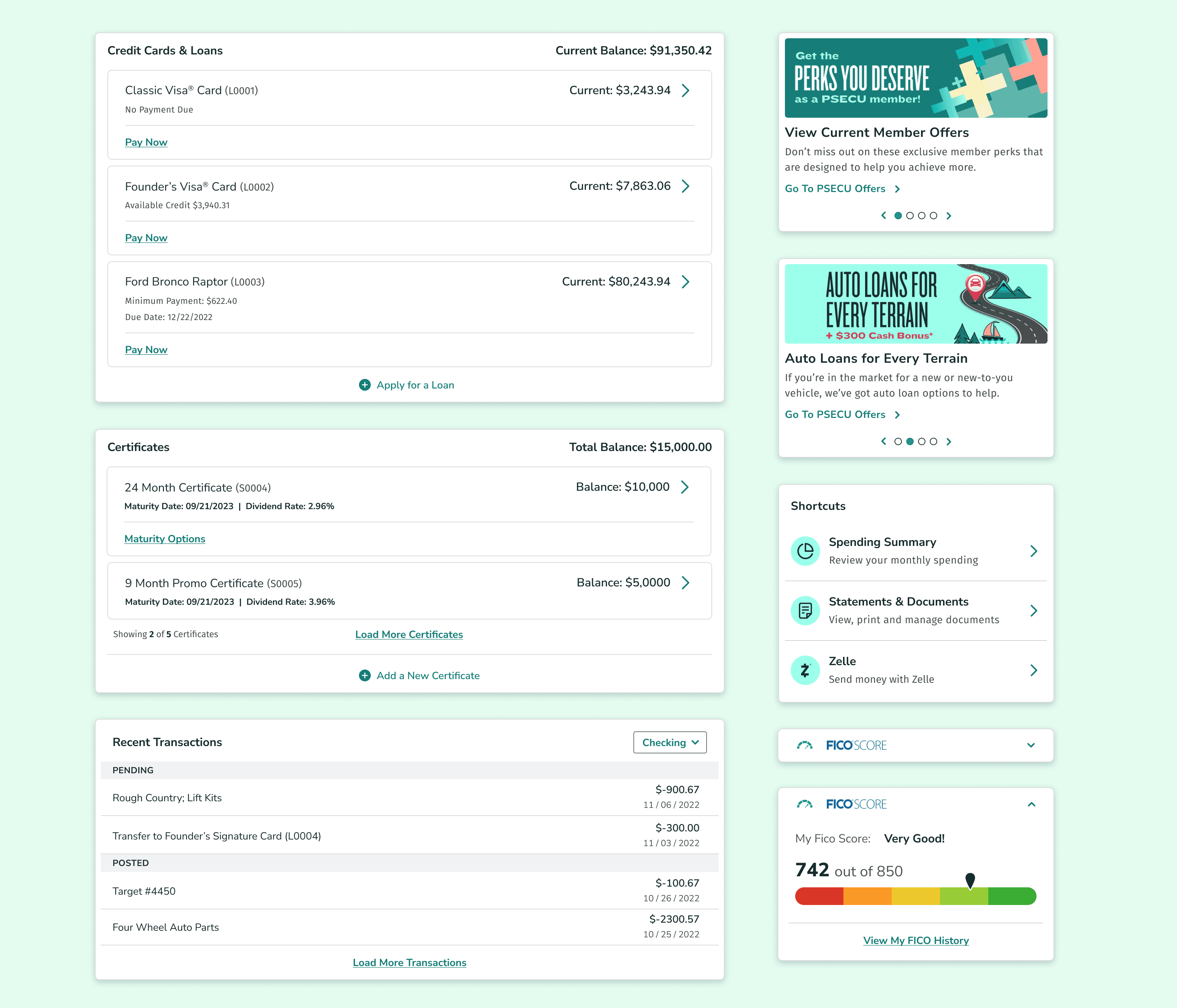
PSECU's revamped dashboard boasts modular elements, reflecting a thoughtful balance between member needs and product team insights. This refresh focuses on a richer user experience, prioritizing accessibility and scalability. The design lays the groundwork for the seamless introduction of future complex features and services, including an enhanced customer service chatbot, personalized offers, and our new spending tracker with categorized reports. This focus on future-proofing ensures the dashboard remains a user-friendly hub for our growing suite of financial offerings.
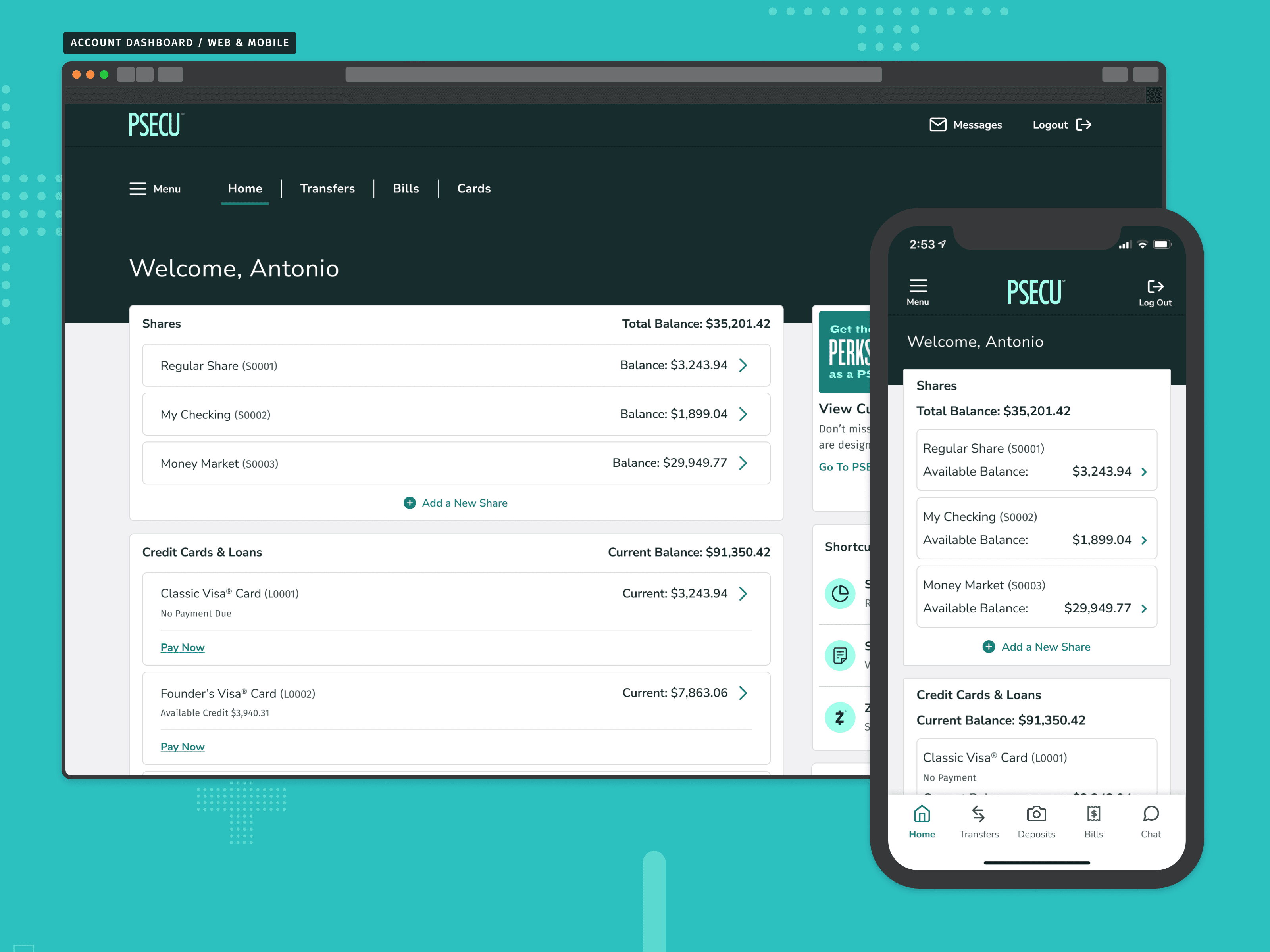
Reimagining PSECU's Digital Hub
A before and after view for PSECU's dashboard refresh.
Researching Problem Space
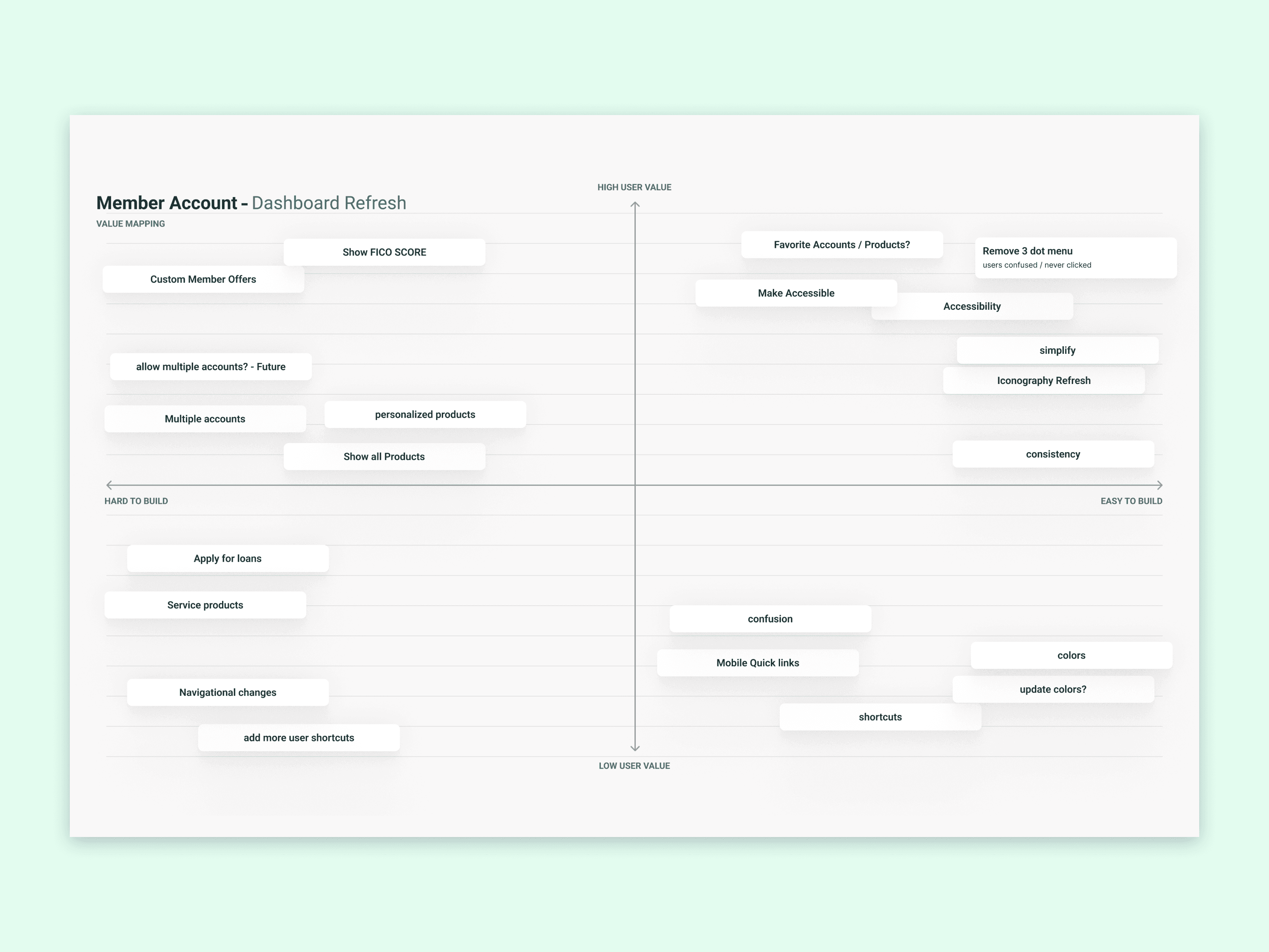
Our product team fostered a collaborative environment, utilizing value mapping to ensure new features aligned with business goals and member needs. I paired with our Voice of Customer team and conducted a high-level web audit of the current dashboard, focusing on user struggle points and instances of "rage clicks" throughout the dashboard. This audit served as a crucial validation point, highlighting the immediate need for a dashboard redesign.
Stakeholder Value Mapping Exercise
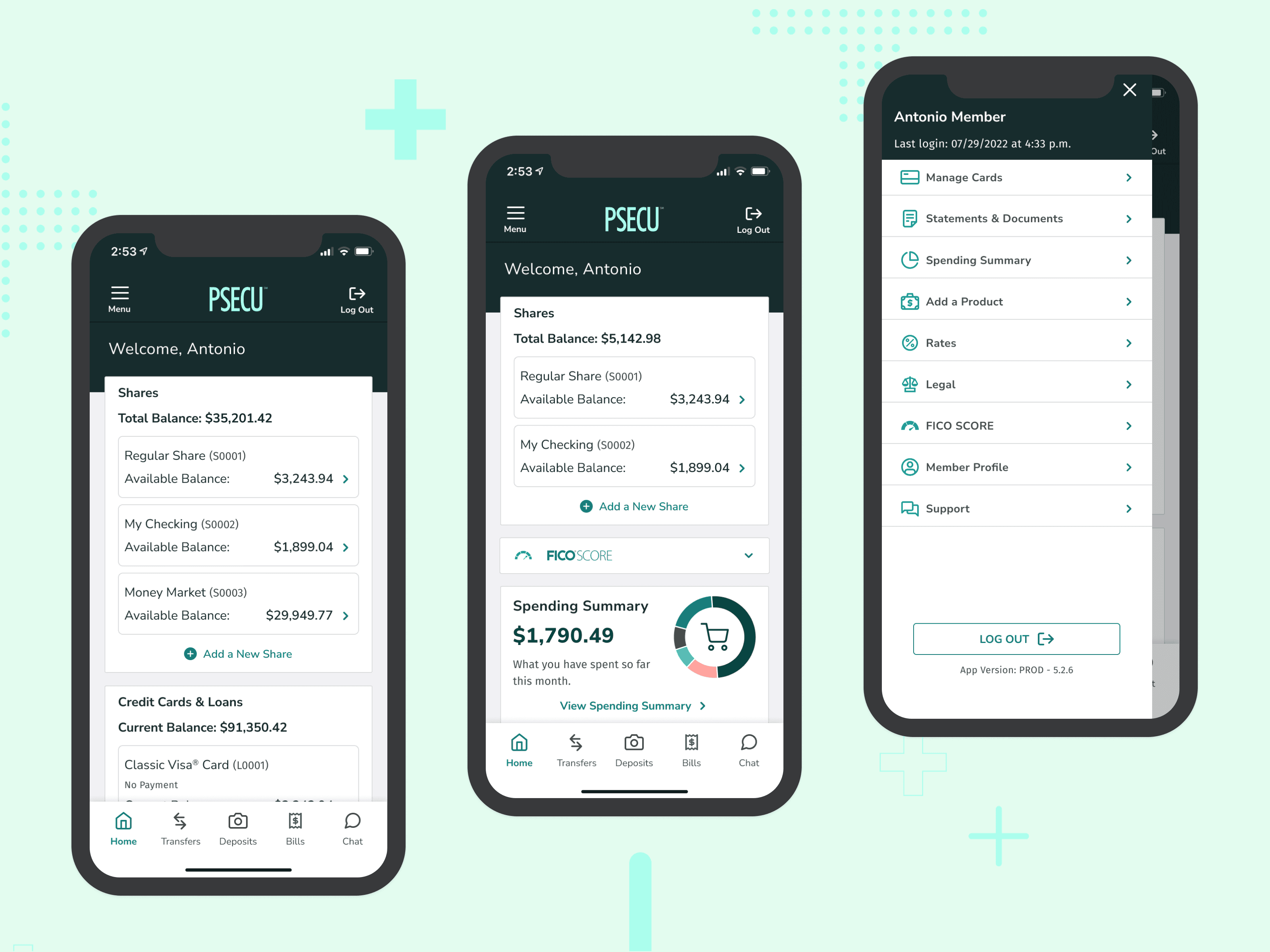
Streamlining Access and Future Proofing Growth
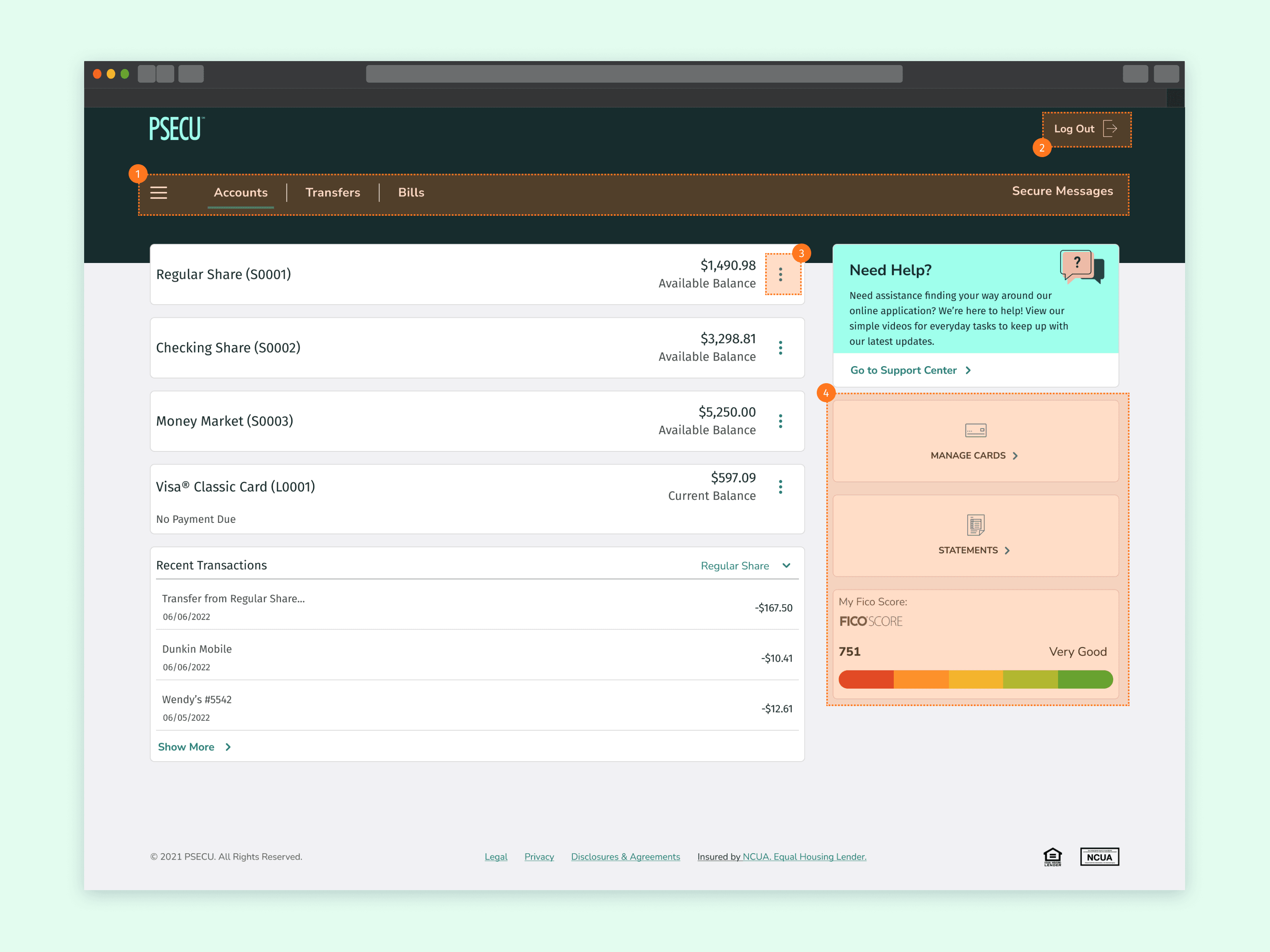
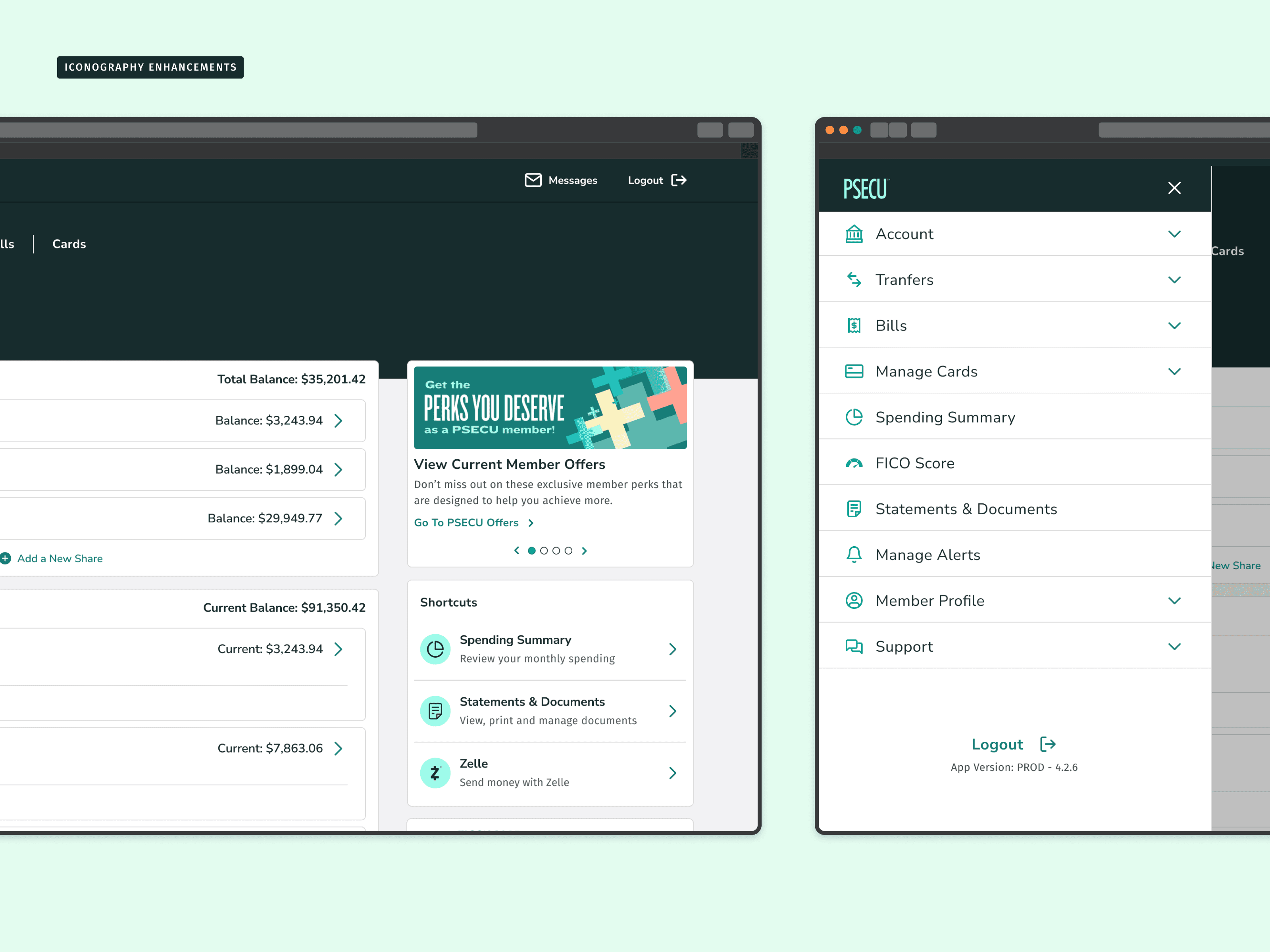
The revamped PSECU dashboard addresses user concerns with a focus on clarity and ease of use. We incorporated familiar brand elements, a refreshed iconography system that improves navigation, and a modern color palette. These changes, alongside a strong consideration for accessibility, dramatically improved our visual hierarchy, transforming the dashboard into a more engaging and user-friendly experience for our members.
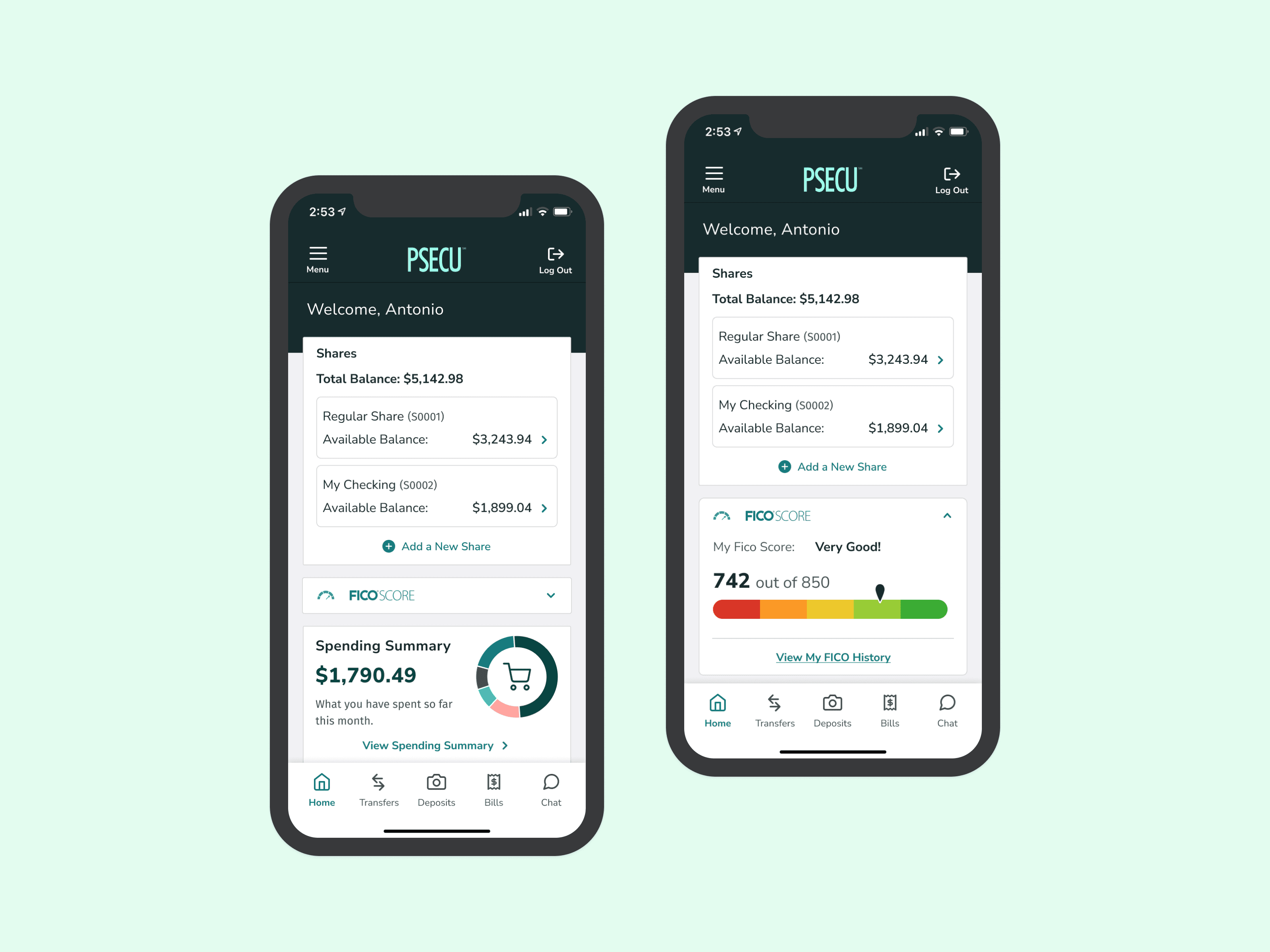
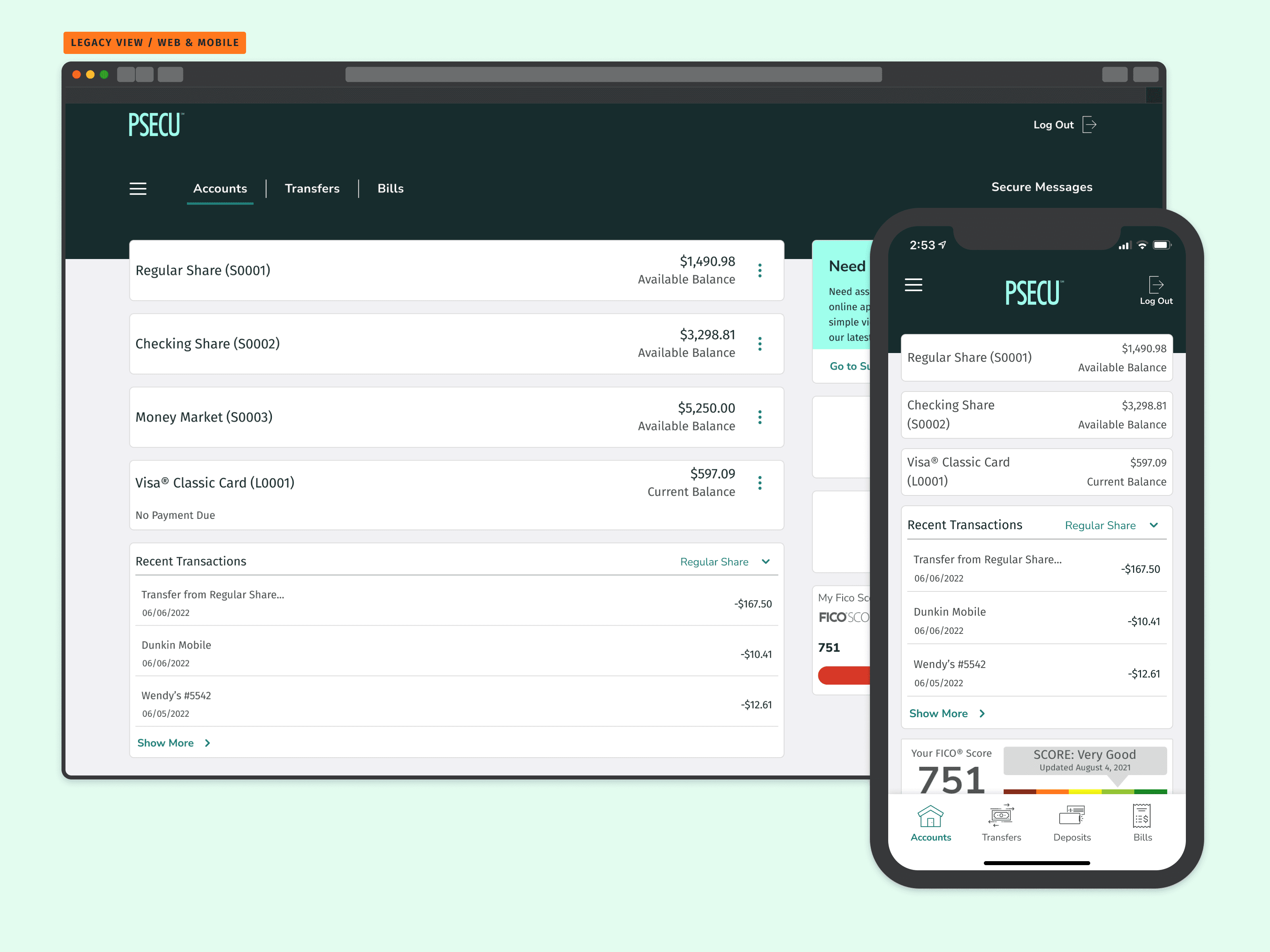
Frustrating to Functional
The original PSECU dashboard lacked clarity, visibility, and a welcoming aesthetic. This experience resulted in low engagement with our members, making navigation feel like a chore. These changes, along with a focus on improved hierarchy, have transformed the user experience. Now, the dashboard is not only functional but also engaging, empowering our members to manage their finances with confidence.
Member Feedback Takeaways
Following the dashboard refresh, member feedback revealed a range of perspectives. While some users expressed a preference for the familiarity of the legacy dashboard, others welcomed the fresh design and its enhanced functionality. This diversity highlights the importance of user research and iterative design to cater to a broad member base.